
Floral
Posted: March 8, 2013 Filed under: Bridge to Terabithia 6 CommentsNot only did these watercolor flowers turn out how I wanted, they were even better than I expected. It was a nice surprise!

Learning
Posted: February 4, 2013 Filed under: Bridge to Terabithia 10 CommentsI’ve been feeling conflicted lately, because this is MY blog and I should get to write about whatever I want to . . . but I like having readers, so I’d rather not drive you all away by writing too much or too little about any subject. (“What if I talk about Darfur too much? What if I don’t talk about Darfur enough?” –Leslie Knope)
Then again, I want to be able to share the things I’m working on – whether that’s teaching Evan to read (slowly . . . very slowly, he has minimal interest and I’d rather not push him too hard or he’ll rebel in a big way), potty-training June (amazing! She’s phenomenal!), what I’ve been reading (nothing much lately, but I just started The Andromeda Strain), or my latest creative project (there are many). You probably guessed that I want to talk more about creative stuff right now. If you aren’t interested, leave now! It’s okay! Just come back later, please?
So I made these Valentine’s Day cards (shamelessly linked) based on a quote from Evan. I more or less edited the quote a tiny bit; it’s more an amalgam of various things he’s said recently. I went through a few variations and asked for opinions, then chose the most popular/my favorite (which thankfully were the same) to print and sell. Jarom mentioned the first time I sketched the quote out that he preferred it without the attribution. I disagreed, and spent the money on printing 20 cards. I picked them up today and – GASP! Jarom was right! No one will want to buy these because it says it’s from a 4-year-old! What if it would have been better to leave the attribution off? What if I had sold a million (or just 20) without the “Evan, age 4” at the bottom?
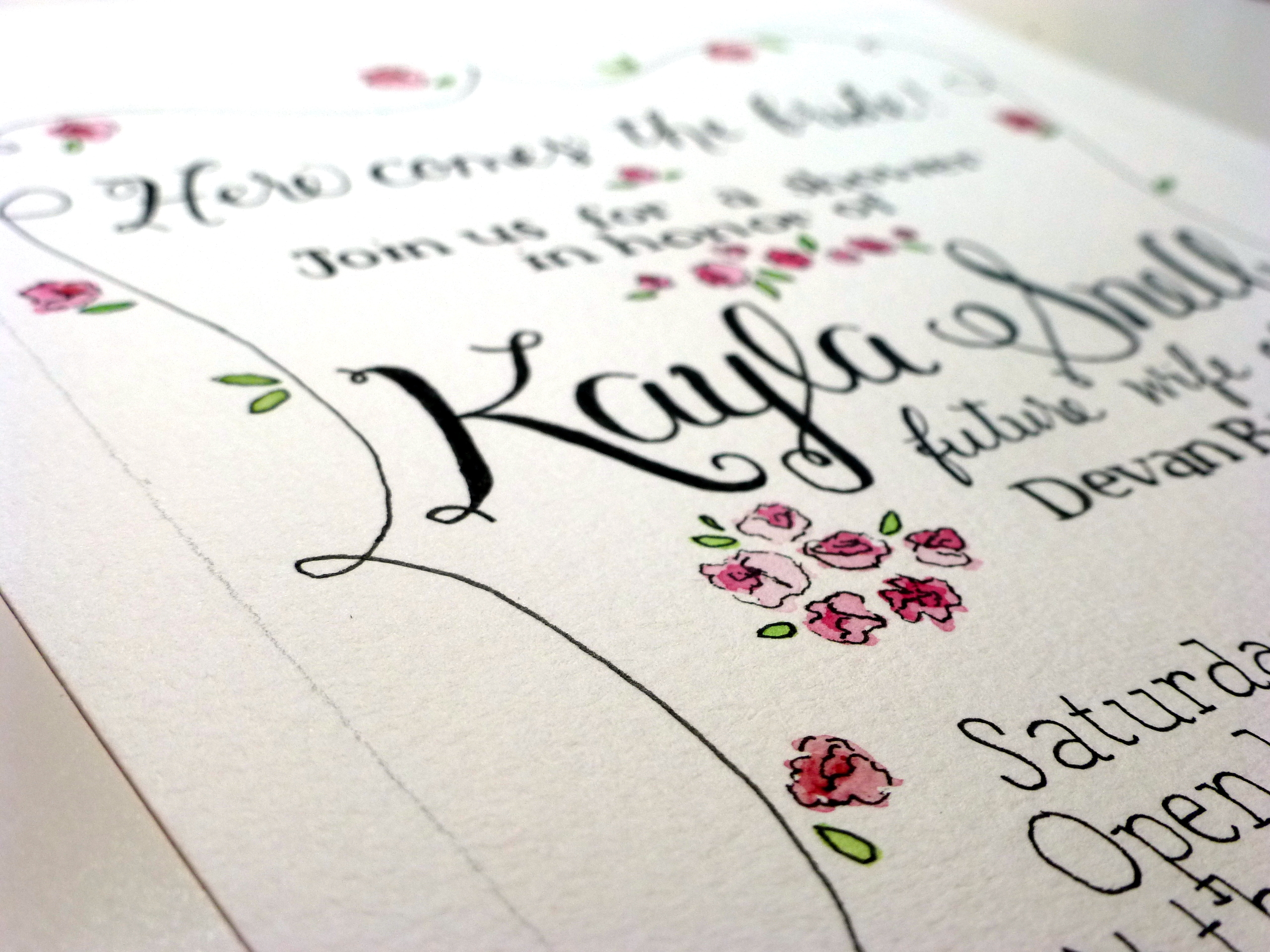
Despite my pointless worries – I can’t afford to print new cards at this point – I’ve learned a few things from the experience. First, practice makes perfect. Or at least it improves things. Since doing our graduation announcements, I’ve gotten used to doing multiple drafts of everything (except blog posts). And it leads to a better final product. Second, my scanner sucks. It was generously given to me, and free is good, but the colors end up completely off (lovely purple watercolors ended up as plain ol’ blue, with almost none of the watercolor effect in the original), and it adds in a lot of noise to the image. A new scanner is high on my list of things to save up for – quickly. Third, when measuring to cut cards down to size, always start on the side that has the least wiggle room. I had to scrap the first card I cut because it printed slightly off center, and I shaved off the bottom of the logo. Fourth, what I love more than doing watercolor is hand-lettering and layout. I did these birth announcements for Evan the other night, and even though there’s a lot to fix, I had fun. Lots of fun. I definitely want to do more of these!

To do: (1) make “Evan” less wibbly-wobbly. (2) increase thickness of outlines. (3) find better bullet point, ditch the star. (4) change the writing in the box to something more awesome. (5) add a border to the whole thing?
Honestly
Posted: January 28, 2013 Filed under: Bridge to Terabithia 8 CommentsI’m trying not to talk TOO much about various art-ish projects on the blog, because I am hoping to make money off of them eventually . . . and I don’t want to sound like I’m begging you to buy stuff.
Good disclaimer?
Guys, I’ve been working hard lately on figuring out what I want to do with my shop, and it’s unbelievably fun and exciting. I spent a while thinking about birthday and shower invitations – what originally got me started with this whole thing – and had trouble deciding what sort of designs would be likable (and easy to sell). Then I decided, I’m doing this for me – so that I have something I enjoy doing. If I make money, even just enough to keep my supplies stocked, hooray! But I lost interest in the idea of pandering to customers. So I sat down one night last week and designed a baby shower invitation. The next day, I designed a birthday party invitation for Jarom. (I’m going to try screen printing it and IT WILL BE AMAZING.) The next night, I completely designed and finished an invitation for Evan’s birthday party.
Most of the designs I came up with don’t actually involve any watercolor. They’re more . . . hand-lettered, and less painterly. I think I’m fine with this because I still have a lot of ideas for watercolor text and watercolor name art in particular. But I love the lettering aspect. Doing our graduation announcements last year was stressful but gloriously fun. (And stressful. Very stressful.) I think my stuff looks pretty awesome.
Here’s where I sort of want your mostly-honest opinions. Like I said at the beginning, I’m not trying to get you to buy stuff. I just want validation that these are legitimately interesting things that other people might buy. (Of course, I’m happy to do work for you guys, too.) The more time I spend looking for similar invitations and art on Etsy, the more I feel like there isn’t anything quite like this – and then I wonder if it’s because no one is interested. (Although, given the hideous nature of 80% of the stuff on Etsy, maybe that’s a good sign.)
Right, so, these are the things I’ve been coming up with lately. If you were having a party or bridal/baby shower, would you like these? I know I have a lot of polishing to do, so maybe you could base your opinion off the potential awesomeness here.

Bad scan of the sketch for Jarom’s birthday invitations. Needs a little work still.

Sketch of baby shower idea. I always mess up on vertical spacing.

Watercolor of baby shower idea. The only waterproof pen I had on hand was a Sharpie, which didn’t work well. I think I’d leave the “It’s a boy!” in white and redo the registration note. I was trying to tie in with the other cursive, unsuccessfully.
![Evan's birthday invitation. Since it's going to 3- and 4-year-olds, I don't care much about fixing any [minor] flaws.](https://hilleries.com/wp-content/uploads/2013/01/kangaroo2a.jpg)
Evan’s birthday invitation. Since it’s going to 3- and 4-year-olds, I don’t care much about fixing any [minor] flaws.
